S&P 500 Sector Breadth — Fixed v6This indicator measures market breadth by tracking how many of the 11 S&P 500 sector ETFs are trading above their 200-day moving average. Here's how to use it:
What It Shows
The indicator plots a line that ranges from 0 to 11, representing the number of sectors in uptrends:
9-11 sectors above MA = Very strong market (green background)
8+ sectors = Strong bullish breadth - most sectors participating
6 sectors = Neutral - market is mixed
4 sectors = Weak market conditions
0-3 sectors = Very weak market (red background)
How to Interpret
Strong Market (8+ sectors):
Broad participation across sectors
Healthy bull market conditions
Lower risk environment
Good time for long positions
Weak Market (≤3 sectors):
Poor market internals
Most sectors in downtrends
Higher risk environment
Consider defensive positioning or cash
Divergences Matter:
If the S&P 500 makes new highs but breadth is declining (fewer sectors above MA), that's a bearish divergence warning
If the S&P 500 is weak but breadth is improving, that can signal a potential bottom
Settings You Can Adjust
Moving Average Length (default 200): Change to 50 or 100 for different trend definitions
Smooth Breadth Line (default 5): Smooths the indicator to reduce noise; set to 0 for raw data
Show Breadth Label: Toggle the current breadth reading on the chart
Alerts
The indicator includes built-in alerts:
When breadth crosses above 8 (strong participation)
When breadth crosses below 4 (deteriorating conditions)
This is a great confirmation tool to use alongside price action and other indicators!
Recherche dans les scripts pour "market internals"

Reversal Correlation Pressure [OmegaTools]Reversal Correlation Pressure is a quantitative regime-detection and signal-filtering framework designed to enhance both reversal timing and breakout validation across intraday and multi-session markets.
It is built for discretionary and systematic traders who require a statistically grounded filter capable of adapting to changing market conditions in real time.
1. Purpose and Overview
Market conditions constantly rotate through phases of expansion, contraction, trend persistence, and noise-driven mean reversion. Many strategies break down not because the signal is wrong, but because the regime is unsuitable.
This indicator solves that structural problem.
The tool measures the evolving correlation relationship between highs and lows — a robust proxy for how “organized” or “fragmented” price discovery currently is — and transforms it into a regime pressure reading. This reading is then used as the core variable to validate or filter reversal and breakout opportunities.
Combined with an internal performance-based filter that learns from its past signals, the indicator becomes a dynamic decision engine: it highlights only the signals that statistically perform best under the current market regime.
2. Core Components
2.1 Correlation-Based Regime Mapping
The relationship between highs and lows contains valuable information about market structure:
High correlation generally corresponds to coherent, directional markets where momentum and breakouts tend to prevail.
Low or unstable correlation often appears in overlapping, rotational phases where price oscillates and mean-reversion behavior dominates.
The indicator continuously evaluates this correlation, normalizes it statistically, and displays it as a pressure histogram:
Higher values indicate regimes favorable to trend continuation or momentum breakouts.
Lower values indicate regimes where reversals, pullbacks, and fade setups historically perform better.
This regime mapping is the foundation upon which the adaptive filter operates.
2.2 Reversal Stress & Breakout Stress Signaling
Raw directional opportunities are identified using statistically significant deviations from short-term equilibrium (overbought/oversold dynamics).
However, unlike traditional mean-reversion or breakout tools, signals here are not automatically taken. They must first be validated by the regime framework and then compared against the performance of similar past setups.
This dual evaluation sharply reduces the noise associated with reversal attempts during strong trends, while also preventing breakout attempts during choppy, anti-directional conditions.
2.3 Adaptive Regime-Selection Backtester
A key innovation of this indicator is its embedded micro-backtester, which continuously tracks how reversal or breakout signals have performed under each correlation regime.
The system evaluates two competing hypotheses:
Signals perform better during high-correlation regimes.
Signals perform better during low-correlation or neutral regimes.
For each new trigger, the indicator looks back at a rolling sample of past setups and measures short-term performance under both regimes. It then automatically selects the regime that currently demonstrates the superior historical edge.
In other words, the indicator:
Learns from recent market behavior
Determines which regime supports reversals
Determines which regime supports breakouts
Applies the optimal filter in real time
Highlights only the signals that historically outperformed under similar conditions
This creates a dynamic, statistically supervised approach to signal filtering — a substantial improvement over static or fixed-threshold systems.
2.4 Visual Components
To support rapid decision-making:
Correlation Pressure Histogram:
Encodes regime strength through a gradient-based color system, transitioning from neutral contexts into strong structural phases.
Directional Markers:
Visual arrows appear when a signal passes all filters and conditions.
Bar Coloring:
Bars can optionally be recolored to reflect active bullish or bearish bias after the adaptive filter approves a signal.
These components integrate seamlessly to give the trader a concise but complete view of the underlying conditions.
3. How to Use This Indicator
3.1 Identifying Regimes
The histogram is the anchor:
High, brightly colored columns suggest trend-friendly behavior where breakout alignment and directional follow-through have historically been stronger.
Low or muted columns suggest mean-reversion contexts where counter-trend opportunities and reversal setups gain reliability.
3.2 Filtering Signals
The indicator automatically decides whether a reversal or breakout trigger should be respected based on:
the current correlation regime,
the learned performance of recent signals under similar conditions, and
the directional stress detected in price.
The user does not need to adjust anything manually.
3.3 Integration with Other Tools
This indicator works best when combined with:
VWAP or session levels
Market internals and breadth metrics
Volume, order flow, or delta-based tools
Local structural frameworks (support/resistance, liquidity highs and lows)
Its strength is in telling you when your other signals matter and when they should be ignored.
4. Strengths of the Framework
Automatically adapts to changing micro-regimes
Reduces false reversals during strong trends
Avoids false breakouts in overlapping, rotational markets
Learns from recent historical performance
Provides a statistically driven confirmation layer
Works on all liquid assets and timeframes
Suitable for both discretionary and automated environments
5. Disclaimer
This indicator is provided strictly for educational and analytical purposes.
It does not constitute trading advice, investment guidance, or a recommendation to buy or sell any financial instrument.
Past performance of any statistical filter or adaptive method does not guarantee future results.
All trading involves significant risk, and users are responsible for their own decisions and risk management.
By using this indicator, you acknowledge that you are fully responsible for your trading activity.

Vince/Williams Market Internals SuiteThis indicator is a powerhouse combination of three distinct market internal strategies developed by Ralph Vince and Larry Williams. Instead of using three separate scripts to monitor market health, this tool consolidates them into a single dashboard that analyzes NYSE "New Lows" data to detect structural rot, capitulation, and crash risks.
The first component is the Volatility Vulnerability monitor, which identifies when the market structure is decaying. It looks for an extended period where the number of New Lows fails to drop to negligible levels. If you see an Orange Circle while price is above the 50 SMA, it is a major warning that the uptrend is hollow and prone to a crash. Conversely, a Blue Circle below the 50 SMA suggests the weakness is already priced in, offering a contrarian entry signal.
The second component is the Selling Climax signal. This identifies moments of pure terror where New Lows hit extreme levels (default 20%). The script marks these panic days with Orange Diamonds, but the real value is the Green Diamond that appears immediately when the panic subsides, often signaling a sharp V-bottom.
Finally, the Bloodbath Rule runs in the background as a defensive filter. When the background turns red (marked by a Red Cross), it means New Lows have breached the "danger" threshold (default 4%). During these periods, internal selling pressure is accelerating, and you should strictly avoid entering new long positions until the background clears.
Note: This script relies on broad market data (ADVN/DECN/LOWN) and works best on Daily timeframes.

VIX Filter/RSI/EMA Bias/Cum-TICK w/ Exhaustion Zone DashboardThis all-in-one dashboard gives intraday traders a real-time visual read of market conditions, combining volatility regime, trend bias, momentum exhaustion, and internal strength — all in a fully customizable overlay that won’t clutter your chart.
📉 VIX Market Regime Detector
Identifies "Weak", "Normal", "Volatile", or "Danger" market states based on customizable VIX ranges and symbol (e.g., VXN or VIX).
📊 RSI Momentum Readout
Displays real-time RSI from any selected timeframe or symbol, with adjustable length, OB/OS thresholds, and color-coded exhaustion alerts.
📈 EMA Trend Bias Scanner
Compares fast and slow EMAs to define bullish or bearish bias, using your preferred timeframe, symbol, and EMA lengths — ideal for multi-timeframe setups.
🧠 Cumulative TICK Pressure & Exhaustion Engine
Analyzes internal market strength using cumulative TICK data to classify conditions as:
-Strong / Mild Bullish or Bearish Pressure
-Choppy / No Edge
-⚠️ Exhaustion Zones — when raw TICK values hit extreme highs/lows, a separate highlight box appears in the dashboard, warning of potential turning points
All logic is customizable, including TICK symbol, timeframes, thresholds, and lookback periods.
Scalpers and day traders who want fast, visual insight into market internals, exhaustion, and trend bias.

Vince/Williams Extreme Volatility VulnerabilityDescription: This indicator implements the "Period of Extreme Vulnerability" concept developed by Ralph Vince and Larry Williams. The theory posits that a healthy market must regularly see the number of New Lows "dry up" (drop to near zero). When the percentage of New Lows fails to drop below a minimal threshold (default 0.15%) for a prolonged period (default 65 days), it indicates that internal market structure is rotting even if prices are rising, leaving the market fragile and prone to sudden volatility shocks.
I have programmed this script to track that exact condition—the extended absence of a "low" New Lows reading. It applies a 50-day Moving Average filter to contextually categorize the signal:
Red Dot (Crash Warning): Triggers when the vulnerability period begins while the price is above the 50 SMA. This is the classic warning signal, indicating that an uptrend is unsupported by market internals and a sharp correction may be imminent.
Green Dot (Contrarian Buy): Triggers when the vulnerability period begins while the price is below the 50 SMA. The script identifies this as a potential capitulation or value point where the persistent internal weakness is likely already priced in.
Note: This indicator requires exchange-wide data (New Lows, Advancers, Decliners) to function. It is best used on daily timeframes.

Vince/Williams Bloodbath Sidestepping RuleThis is a defensive risk management tool designed to keep you on the sidelines during devastating market crashes. Drawing on the "Bloodbath" criteria outlined by Vince and Williams, this script highlights periods where market internals have structurally broken down, specifically when the percentage of New Lows exceeds a "danger" threshold (default 4%).
Unlike the Climax signal which looks for the end of a drop, this rule is designed to spot the acceleration phase of a decline. When the background turns red, it indicates that the market is in a liquidating phase where support levels are likely to fail. You should use this as a strict filter to avoid opening new long positions or to tighten stops on existing ones until the background color clears, signaling that the internal bleeding has stopped.

Price Correction to fix data manipulation and mispricingPrice Correction corrects for index and security mispricing to the extent possible in TradingView on both daily and intraday charts. Price correction addresses mispricing issues for specific securities with known issues, or the user can build daily candles from intraday data instead of relying on exchange reported daily OHLC prices, which can include both legitimate special auction and off-exchange trades or illegitimate mispricing. The user can also detect daily OHLC prices that don’t reflect the intraday price action within a specified percent deviation. Price Correction functions as normal candles or bars for any time frame when correction is not needed.
On the 4th of October 2022, the AMEX exchange, owned by the New York Stock Exchange, decided to misprice the daily OHLC data for the SPY, the world’s largest ETF fund. The exchange eliminated the overnight gap that should have occurred in the daily chart that represents regular trading hours by showing a wick connecting near the close of the previous day. Neither the SPX, the SP500 cash index that the SPY ETF tracks, nor other SPX ETFs such as VOO or IVV show such a wick because significant price action at that level never occurred. The intraday SPY chart never shows the price drop below 372.31 that day, but there is a wick that extends to 366.57. On the 6th of October, they continued this practice of using a wick that connects with the close of the previous day to eliminate gaps in daily price action. The objective of this indicator is to fix such inconsistent mispricing practices in the SPY, NYA, and other indices or securities.
Price Correction corrects for the daily mispricing in the SPY to agree with the price action that actually occurred in the SPX index it tracks, as well as the other SPX ETFs, by using intraday data. The chart below compares the Price Correction of the SPY (top) to the SPX (middle) and the original mispriced SPY (bottom) with incorrect wicks. Price correction (top) removes those incorrect wicks (bottom) to match the SPX (middle).
The daily mispricing of the SPY follows after the successful deployment of the NYSE Composite Index mispricing, NYA, an index that represents all common stocks within the New York Stock Exchange, the largest exchange in the world. The importance of the NYA should not be understated. It is the price counterpart to NYSE’s market internals or statistics. Beginning in 2021, the New York Stock Exchange eliminated gaps in daily OHLC data for the NYA by using the close of the previous day as the open for the following day, in violation of their own NYSE Index Series Methodology. The Methodology states for the opening price that “The first index level is calculated and published around 09:30 ET, when the U.S. equity markets open for their regular trading session. The calculation of that level utilizes the most updated prices available at that moment.” You can verify for yourself that this is simply not the case. The first update of the NYA price for each day matches the close of the previous day, not the “most updated prices available at that moment”, causing data providers to often represent the first intraday bar with a huge sudden price change when an overnight price change occurred instead. For example, on 13 Jun 2022, TradingView shows a one-minute bar drop 2.3%. With a market capitalization of roughly 23 trillion dollars, the NYSE composite capitalization did not suddenly drop a half-trillion dollars in just one minute as the intraday chart data would have you believe. All major US indices, index ETFs, and even foreign indices like the Toronto TAX, the Australian ASXAL, the Bombay SENSEX, and German DAX had down gaps that day, except for the mispriced NYSE index. Price Correction corrects for this mispricing in daily OHLC data, as shown in the main chart at the top of this page comparing the original NYA (top) to the Price Corrected NYA (bottom).
Price Correction also corrects for the intraday mispricing in the NYA. The chart below shows how the Price Correction (top) replaces the incorrect first one-minute candles with gaps (bottom) from 22 Sep 2022 to 29 Sep 2022. TradingView is inconsistent in how intraday data is reported for overnight gaps by sometimes connecting the first intraday bar of the day to the close of the previous day, and other times not. This inconsistency may be due to manually changing the intraday data based on user support tickets. For example, after reporting the lack of a major gap in the NYA daily OHLC prices that existed intraday for 13 Jun 2022, TradingView opted to remove the true gap in intraday prices by creating a 2.3% half-a-trillion-dollar one-minute bar that connected the close of the previous day to show a sudden drop in price that didn’t occur, instead of adding the gap in the daily OHLC data that actually took place from overnight price action.
Price Correction allows users to detect daily OHLC data that does not reflect the intraday price action within a certain percent difference by changing the color of those candles or bars that deviate. The chart below clearly shows the start of the NYSE disinformation campaign for NYA that started in 2021 by painting blue those candles with daily OHLC values that deviated from the intraday values by 0.1%. Before 2021, the number of deviating candles is relatively sparse, but beginning in 2021, the chart is littered with deviating candles.
If there are other index or security mispricing or data issues you are aware of that can be incorporated into Price Correction, please let me know. Accurate financial data is indispensable in making accurate financial decisions. Assert your right to accurate financial data by reporting incorrect data and mispricing issues.
How to use the Price Correction
Simply add this “indicator” to your chart and remove the mispriced default candles or bars by right clicking on the chart, selecting Settings, and de-selecting Body, Wick, and Border under the Symbol tab. The Presets settings automatically takes care of mispricing in the NYA and SPY to the extent possible in TradingView. The user can also build their own daily candles based off of intraday data to address other securities that may have mispricing issues.

Timed Reversion Markers (Custom Session Alerts)This script plots vertical histogram markers at specific intraday time points defined by the user. It is designed for traders who follow time-based reversion or breakout setups tied to predictable market behavior at key clock times, such as institutional opening moves, midday reversals, or end-of-day volatility.
Unlike traditional price-action indicators, this tool focuses purely on time-based triggers, a technique often used in time cycle analysis, market internals, and volume-timing strategies.
The indicator includes eight fully customizable time inputs, allowing users to mark any intraday minute with precision using a decimal hour format (for example, 9.55 for 9:55 AM). Each input is automatically converted into hour and minute format, and a visual histogram marker is plotted once per day at that exact time.
Example use cases:
Mark institutional session opens (e.g., 9:30, 10:00, 15:30)
Time-based mean reversion or volatility windows
Backtest recurring time-based reactions
Highlight algorithmic spike zones
The vertical plots serve as non-intrusive, high-contrast visual markers for scalping setups, session analysis, and decision-making checkpoints. All markers are displayed at the top of the chart without interfering with price candles.

Cumulative SymbolThis indicator attempts to show price source delta, mostly for intraday trading but may have applications on higher timeframes.
Choose a different symbol from the chart, or use formulas, pick price source (close, open, lows, etc) and a cumulation calculation type.
There are three to choose from and the tooltip provides the differences, they are as follows:
1) Basic - quite simply just takes the symbol source value and keeps a rolling summation
2) Advance or Decline - handles negative values as reductions to the cumulative calculation, useful to find delta pivot areas
3) Ratio - useful for ... ratio symbols ... such as market internals or your own custom ratios where 0 is balance/mid.
The trend line can be adjusted via length, histogram and trend colors indicate trend and directional shifts at a glance.
Since many ratio symbols, and some indexes, (looking at you NYA), don't offer volume I opted to drop it from this indicator.
I think every other indicator that tracks delta on TradingView makes use of volume and I couldn't find a single one that didn't and as such there is a gap in the vast library of indicators.
Enjoy!

NYSE TicksDisplays NYSE ticks as histogram.
Part of market internals dashboard, so make sure to check the other indicators as well.
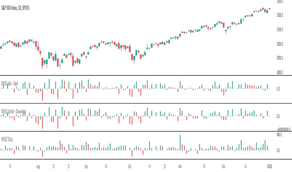
NYSE UpVol - DownVolDisplays NYSE up volume - NYSE down volume as histogram.
Part of market internals dashboard, so make sure to check the other indicators as well.

NYSE Adv - DeclDisplays NYSE advancing stocks - NYSE declining stocks as histogram.
Part of market internals dashboard, so make sure to check the other indicators as well.
